What I owned
Led design end-to-end across patient and clinic apps, iOS-first, with the period tracker as a core feature.
Taa Marbuta
2 apps designed
Taa Marbuta · 2024HealthTech · 0→1 · RTL-first · 2024
Led an RTL-first female health product from zero across patient and clinic apps, iOS-first, designed for Arab women.
Client-provided research made the first session a trust-sensitive moment, not just onboarding.
apps designed
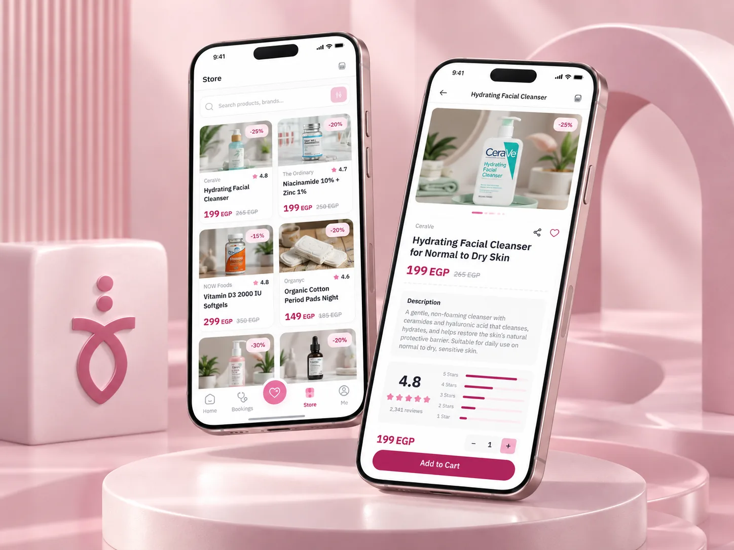
Taa Marbuta was designed for Arab women navigating local health contexts. I worked as the solo UX/UI designer with two mobile developers, a backend developer, and a project manager. Language, cultural sensitivities, booking, and follow-up shaped the product constraints from the start.
Led design end-to-end across patient and clinic apps, iOS-first, with the period tracker as a core feature.
RTL-native from day zero, with trust signals and booking decisions designed for Arab women.
The problems
Client-provided market research made trust and onboarding quality central to the first session.
The digital booking flow had to make the next step clearer than a phone call.
Interviews identified doctor credentials, verification badges, and review context as part of the booking decision.
The clinic app needed tools for the working day, not just a display of bookings.
The decisions
Mapped why women abandon, trust, onboarding quality, and the gap between a phone call and a digital booking.
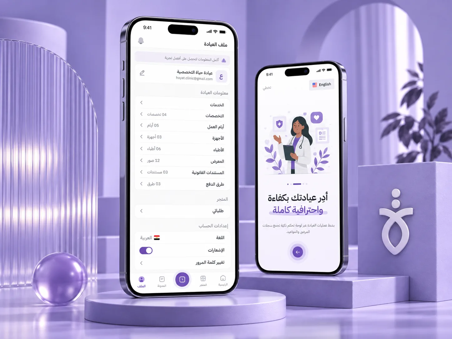
Built an Arabic typography hierarchy and laid every flow out RTL-native, never retrofitted from an English layout.
Split patient and clinic into distinct apps, each tuned to how that user actually thinks and works.
The solutions
The Arabic experience was the primary experience, not a retrofit, not a translation.
Built an Arabic typography hierarchy optimized for health-content readability, with every layout designed RTL-native.
Doctor credentials, clinic verification badges, and review authenticity signals woven throughout the booking journey.
Client internal analysis reported 3× higher engagement with period-tracker features.
Calendar → daily log (expanded + collapsed) → history → predictions, all inside a dedicated Health Hub.
Patient app (5-tab) and clinic app (4-tab), each with flows tuned to how that user researches and books.
apps: patient + clinic
client-reported period-tracker engagement
client-provided two-week abandonment research
Project period: 2–2.5 months
Arabic-first, not a translated afterthought.
Gallery
Key visuals from the project, then the individual decision screens. Full-fidelity shots of those are coming soon.
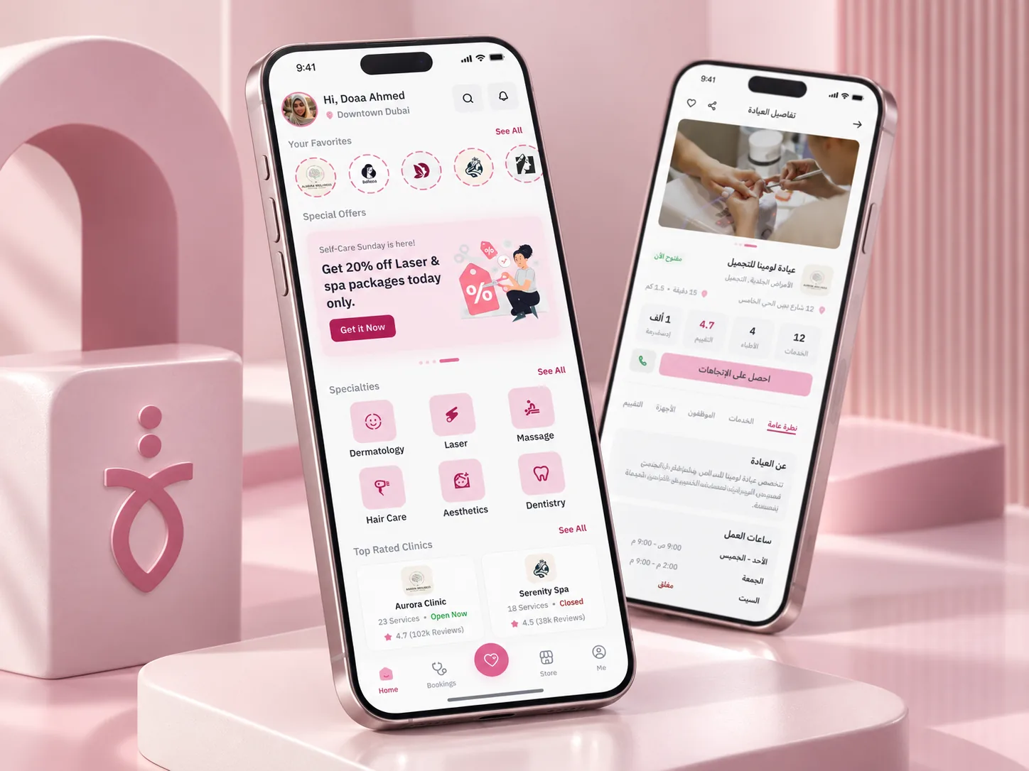
For sensitive health journeys, I would treat credentials, verification, and review context as part of the booking decision, not decorative UI.
Related work